Project information
- Category: Visualization
- Tools: Tableau, Figma
- Project URL: Click here
Overview
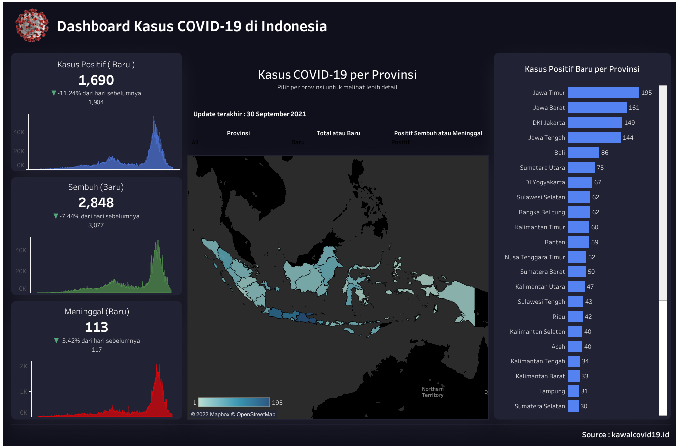
In this project, I created a dashboard that displays Covid-19 cases per province in Indonesia. The data used is in the range of March 21, 2020-September 30, 2021. In this project I visualize the trend of increasing positive cases of Covid-19, both daily and cumulative increases. I also visualize for daily and cumulative recovery and death trends.